Recent searches
Search options
NEW ARTICLE
How many photos are uploaded to Flickr? Where? By who? Why does any of it matter? We explore the rise and fall of #Flickr in this @digigeolab paper by yours truly, Vuokko Heikinheimo, @eklund_jo, Anna Hausmann & @tuuli – now out in the Journal of Outdoor Recreation and Tourism.
Article: https://authors.elsevier.com/sd/article/S2213-0780(25)00026-X
Thread
You might wonder: “Flickr, the photo-uploading platform from ten years ago!?”. Yes, it’s a wonderful platform for many reasons, not the least of which is its open, Web 2.0.-esque API. It is easy to get geolocated data from anywhere. This has made Flickr popular as a way to approximate people’s presence and preferences in research; think tourist movements, finding hotspots in a city, etc. not to mention that Flickr underlies many computer vision datasets and models.
User-generated datasets that are only incidentally useful for research purposes have a problem: little is known about them. How many observations are there? Where are those observations? Who made them? Without these, we know little about the baggage and biases brought into subsequent analyses. We address this by describing the spatial and temporal patterns of 227M geolocated photos in 2010–2022 by ~1.5M users. We focus on why this matters when studying people’s recreational visits to nature
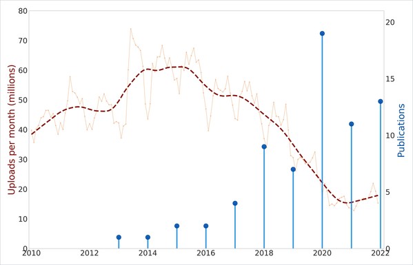
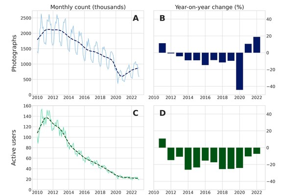
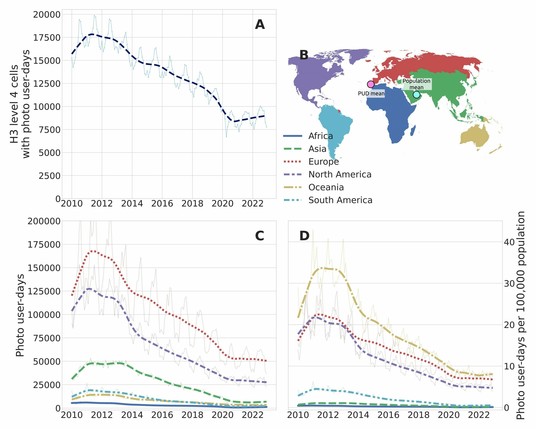
What did we find? (1) the popularity of Flickr has dropped significantly over the 13 year study period. Especially the number of active users has seemingly taken a nosedive.
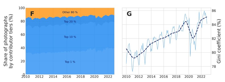
(2) More of that remaining data is produced by the most active ‘super-users’ of Flickr – top 1 % of users uploaded about 1 / 3 of the photos!
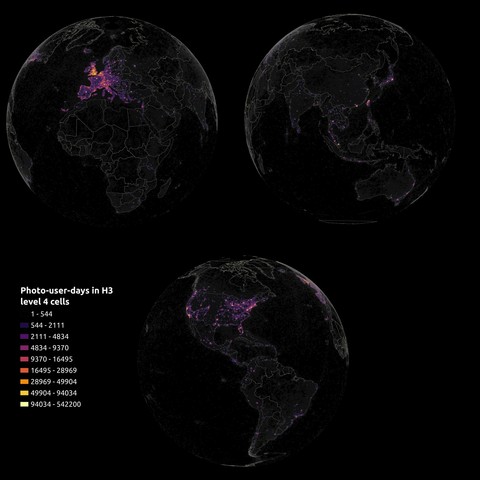
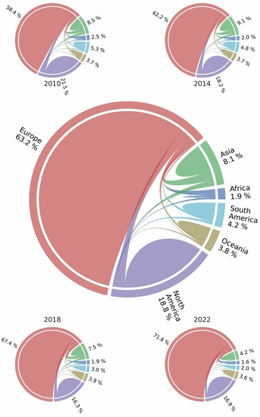
(3) Flickr is clearly a platform of the "Global North": it’s users and use are concentrated in Europe and North America. Over time, an even greater share of use is in Europe.
(4) All of this is reflected on who make posts from nature, or protected areas in this case. For example, Europeans and North Americans make about ¾ of the visits to African protected areas on Flickr.
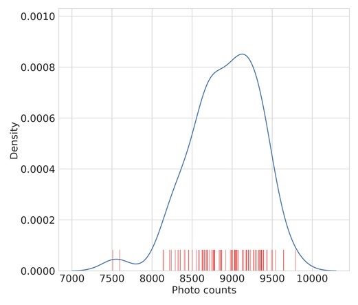
(5) Finally, we tested the reliability of data acquisition from the platform and found that the API responds inconsistently to repeated queries.
Drawing it all together, we argue that these trends and biases (shrinking user-base in the Global North, and an inconsistent API) should be considered if opting for Flickr data. For example, if Flickr is used a proxy for people visiting national parks, does a drop over time indicate a fall in visits or the popularity of Flickr? Naturally, this is not limited to Flickr: all research that uses user-generated dataset opportunistically face similar questions.
We hope to help future research by sharing the aggregated datasets presented above as figures and processing codes to produce them: https://doi.org/10.6084/m9.figshare.27055018.v1
Thank you to #Kone & Mai and Tor Nessling Foundations for supporting this work. A quantitative work like this would not be possible without a robust suite of FOSS tools. My thanks to the maintainers of #QGIS, #pandas, #geopandas, #duckdb, #dask, #statsmodels, #jupyter and many more!
BONUS
Random highlights from the dataset:
1) Median time between capturing a photo and uploading it to Flickr is one week.
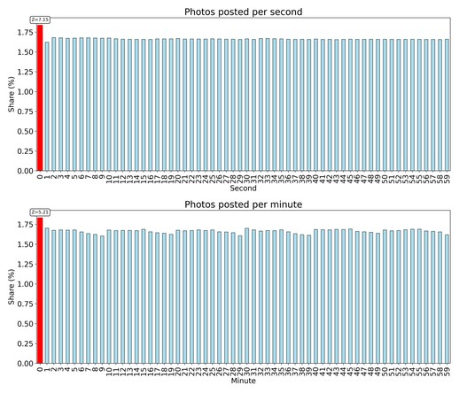
2) People (or bots) like to upload on round figures (see pic)
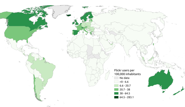
3) Normalized by population, Iceland has the most Flickr users in our dataset.
BTW, I tried to explain the plots also in the alt texts; they might help if some of the plots don't make sense.

